Express Liquidation
Website design for Express Liquidation, creating a clear, credible digital experience for a business operating in a complex and highly competitive market.

Brand · Landing Page · B2B

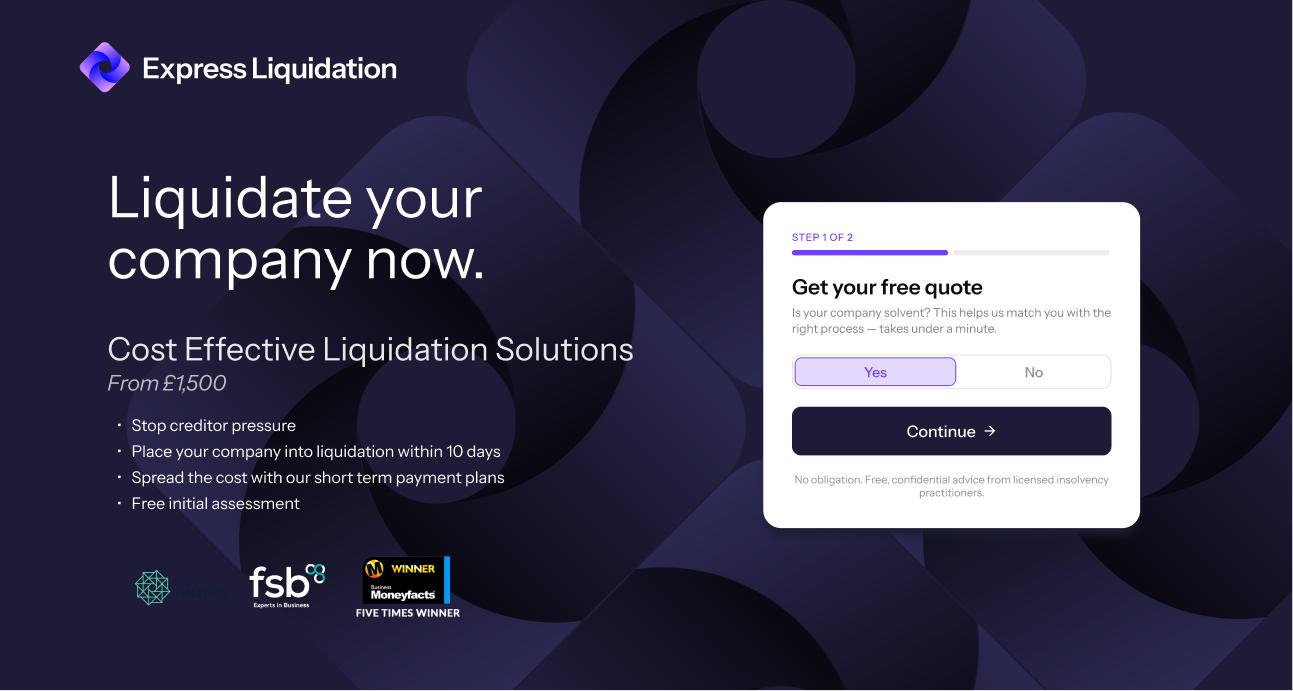
Express Liquidation landing page hero design

Redesigned a liquidation sub-brand's identity and landing page to build trust before asking for action

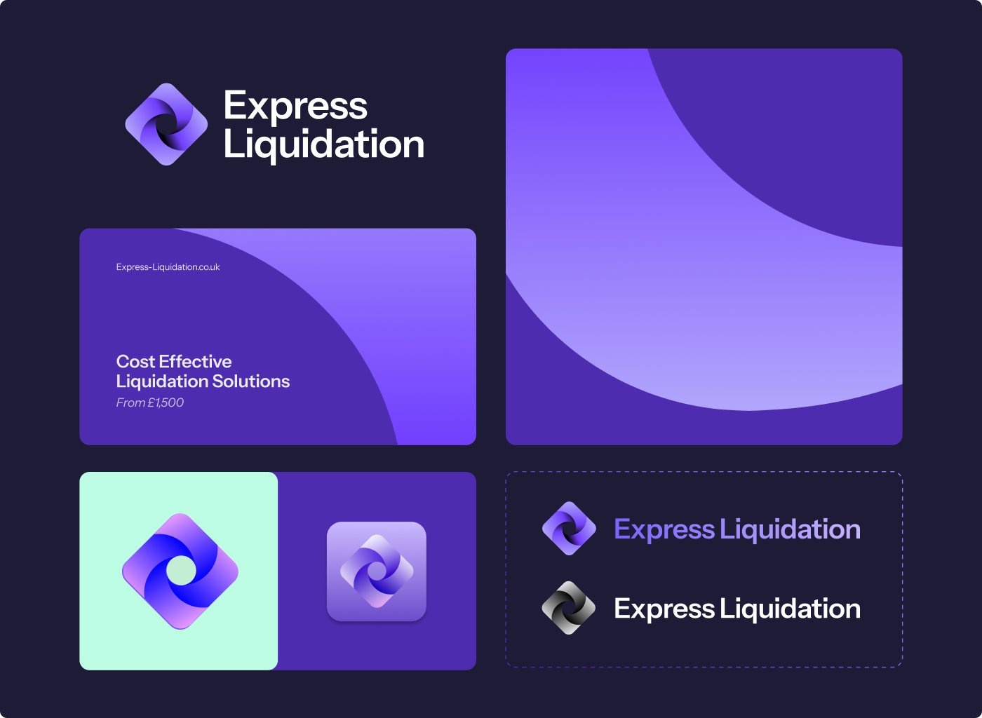
Produced during a short contract role with SFP / Touch Financial. Towards the end of the engagement, I redesigned their sub-brand, Express Liquidation's identity and created a new landing page for companies looking to begin the liquidation process as quickly as possible.

Deliverables: Sub-brand redesign. Landing page UI design.

The problem:
Liquidation is a serious, often stressful decision, and the existing sub-brand didn't read as professional or trustworthy at a moment when that mattered most. The landing page needed to move visitors toward starting the process quickly, without feeling like a hard sell.

The tension: how do you make the process feel straightforward without making the user feel pressured?

Key decisions:

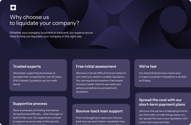
Decision 1: Build trust before asking for action. The visual direction needed to communicate stability and credibility immediately. Rather than relying on aggressive messaging or attention-grabbing visual treatments, I focused on a more composed identity that could make the service feel dependable.

Express Liquidation trust and key features section

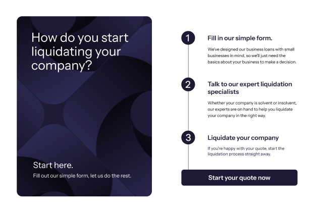
Decision 2: Make the next step clear. The landing page was structured around a direct path into the process. Information was prioritised so visitors could quickly understand what Express Liquidation offered, whether it was relevant to them, and how to get started.

Express Liquidation quote process steps section

Decision 3: Use clarity instead of pressure. The design avoided a hard-sell approach. Clear messaging, considered hierarchy, and a straightforward layout were used to reduce uncertainty and help users make an informed decision.

Solution:
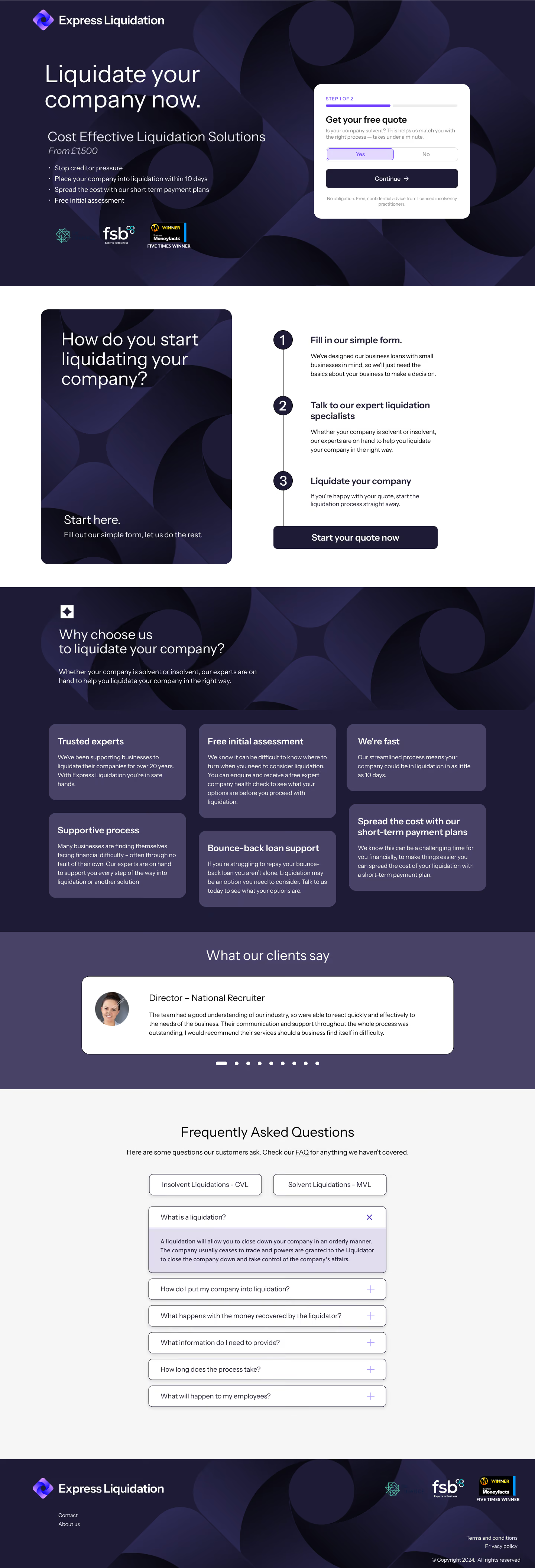
I developed a refreshed visual direction for the Express Liquidation sub-brand and translated it into a focused landing page UI. The redesign aimed to give the sub-brand a more professional and trustworthy presence, while the landing page created a clearer route from initial consideration to taking action.

Express Liquidation quote process steps section

Outcome:
The redesign and landing page concept were shared with the client but were not ultimately built or put into use. As a result, there are no live performance metrics or user outcomes to report. The project remains a concept, but it demonstrates how I approach brand and digital design for high-consideration services: establish trust, reduce ambiguity, and create a clear next step without relying on pressure.

Reflection:
If this had gone live, I'd have wanted to see it measured against the existing page — specifically whether the brand and visual design improved conversion, or whether it mainly improved trust in the company rather than directly driving action. The contract ended before there was any appetite from senior management to invest further, so it remains an untested concept.

COLOPHON
Designed in Figma
Built in Webflow with GSAP. 100% template free.
Font: Instrument Sans by Instrument
Copyrights.
Rights to clients work owned by clients & SevenC3, used with permission.
All other works copyright by Greg Owen.