Fujitsu
Design in Action microsite
UX/UI Design · B2B · Editorial

I designed the primary content hub for Fujitsu's human-centred design programme, designed to make dense thought-leadership content readable and engaging for an enterprise audience.

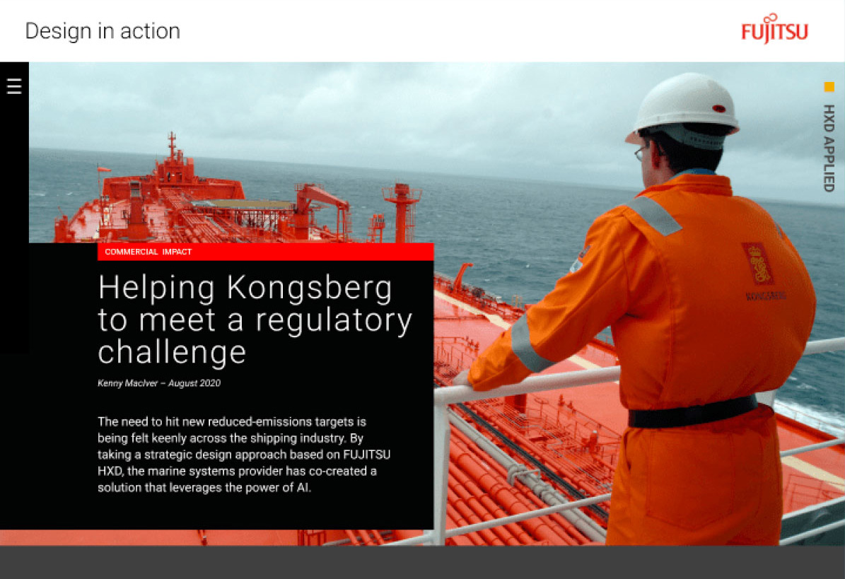
Fujitsu's Design in Action programme explored human-centred design approaches within enterprise contexts. I designed and working with our development team, to create a microsite to house the programme's content: articles, case studies, and thought leadership aimed at a B2B technology audience.


Fujitsu, Design in action

Context:
Fujitsu's Design in Action programme explored human-centred design approaches within enterprise contexts.
My role: UI designer for the programme's microsite.
Deliverable: website UI design.
Worked with the Fujitsu editorial team, our lead developer, and a PM.

The problem:
Enterprise thought-leadership content has a specific challenge: it's dense, it's long-form, and the audience (senior enterprise decision-makers) has limited patience.

The tension: how do you present serious, substantive content in a way that feels designed and readable rather than like a white paper dumped online, while still respecting the intelligence of the audience and the weight of the material?
Key decisions:
Decision 1: Design ahead of the content

What we considered:
Wait for draft articles before finalising the site structure, or design a flexible editorial template that could absorb content as it was written.

Why we chose this: The three-week timeline didn't allow for waiting. A typographically-led, flexible structure meant the site could go live and articles could be dropped in as they were finished.

What we accepted: Less certainty the final layout would suit every piece perfectly — some retrofitting was inevitable once real content arrived.

Decision 2: Move fast over getting it fully right
What we considered: Push for more time to develop a richer, more ambitious experience, or accept the deadline and ship something solid within it.

Why we chose this: The programme needed a live home in three weeks. A dependable, well-executed editorial site beat an ambitious one that might not land in time.

What we accepted: A more conservative visual and interaction approach than the content, or Fujitsu's own innovation positioning, probably deserved.
Fujitsu Digital CxO - Co-creating a flood warning system...article
Solution:
Designed a content-led microsite with a typographic, editorial structure. The site served as the primary content hub for the programme's duration, housing thought-leadership articles and programme information. Promo display ads were featured across Fujitsu sites, including their dedicated thought-leadership publication.

Outcome:
The site remained in use for longer than expected given the timeline it was built under. After roughly a year, the content was absorbed into a broader Fujitsu site.

Reflection:
I wish i'd pushed harder for a more innovative approach. We delivered a clean editorial experience, which could have been much richer, and inline with Fujitsu's own innovation, had we introduced motion and microinteractions to bring the content to life.
Fujitsu Design in Action microsite shown on mobile
COLOPHON
Designed in Figma
Built in Webflow with GSAP. 100% template free.
Font: PP Neue Montreal by PangramPangram
Copyrights.
Rights to clients work owned by clients & SevenC3, used with permission.
All other works copyright by Greg Owen.