Context:
Sainsbury's Magazine, one of the UK's most established food and lifestyle magazines, underwent a full print-led visual rebrand.
The problem:
A print rebrand looks different on paper than it does on screen, and there was no budget or buy-in for a full design system to bridge the gap.
The tension: how do you bring structure and consistency to a large, content-heavy magazine site without the resourcing to build a formal design system, while also fitting in an advertising model that needed to work across wildly different desktop and mobile usage patterns.


Key decisions:
Decision 1: Content-first structure, without a formal design system
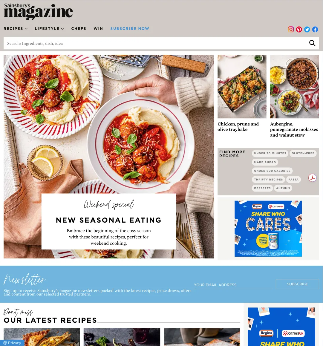
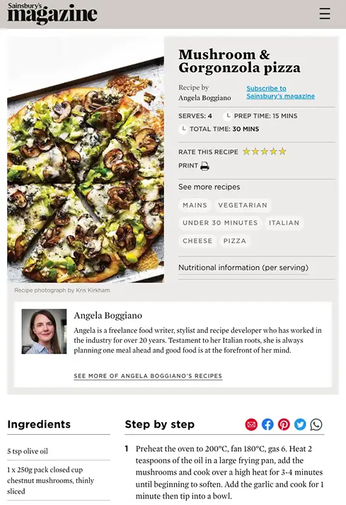
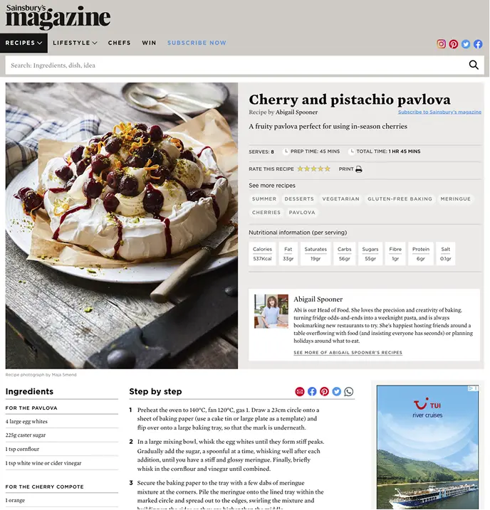
What we considered: Whether to attempt a top-down design system despite no dedicated budget, or work content-first, running a content audit, planning new sections with the digital editors, then componentising recurring patterns and wireframing templates page by page.
Why we chose this: Without system buy-in, a content-first approach was the realistic path to consistency. Auditing existing content and defining sections with the editorial team meant the componentised patterns that followed were grounded in what the magazine actually needed, not an abstract system built in isolation.
What we accepted: No formal, documented design system, structure and consistency were built incrementally through content patterns and page templates rather than a top-down framework.

Decision 2: A tiered advertising system built around a desktop/mobile mismatch
What we considered: A tiered ad model, standard mixed ad placements, full takeover of standard ad spots, and premium page wrappers, including a parallax-reveal banner concept that was explored but not approved. The chosen wrapper format was a triptych: a single ad message spread across three full-width banners, anchored in position and revealed through gaps in the content as the page scrolled, adapted from a technique seen on Wallpaper* magazine's site.
Why we chose this: Desktop carried the most ad inventory but the least traffic; mobile was the inverse. A tiered system let advertising scale in ambition, and price, without depending on the weaker desktop traffic to justify it.
What we accepted: More design and build complexity to support three ad tiers plus subscription pop-ups and slide-outs, rather than a single standard ad format.

Decision 3: Email as a primary channel, not a secondary deliverable
What we considered: How much design investment the newsletter warranted relative to the core site.
Why we chose this: The subscriber list numbers already proved email was a primary channel before any strategic framing, the data made the case for treating it as a first-class format, designed and built as responsive HTML from scratch rather than an afterthought.
What we accepted: The technical overhead of building responsive HTML email that holds up across inconsistent email clients, justified by the channel's proven reach.

Solution:
Led UI design across the full site, a content audit followed by componentised, editor-informed section patterns, then page-by-page template design for catalogue pages, recipe layouts, and editorial features. Designed and built a tiered advertising system including standard placements, full-spot takeovers, and triptych page wrappers, plus a dedicated advertising hub microsite documenting every ad opportunity on the site with design specs for each position, for the ad team to reference. Designed and built responsive HTML newsletter templates from scratch.
Outcome:
Newsletter readership grew from roughly 80,000+ to over 150,000+ subscribers following the redesign. Advertising opportunities roughly doubled through the tiered ad system, including the new wrapper formats. The redesign shipped across all digital touchpoints alongside the print relaunch.
Reflection:
No formal design system was ever signed off, and the content-first, page-by-page approach did work, but in hindsight, that was the wrong call. I have a bias toward wanting a proper system in place, and this was a case where that bias was right: without one, the site accumulated inconsistencies over time that a documented system would have caught earlier. I'd push harder for that investment if I did this again, even without full buy-in at the start.